Excel 365
Adding Up/Down Bars to a line chart
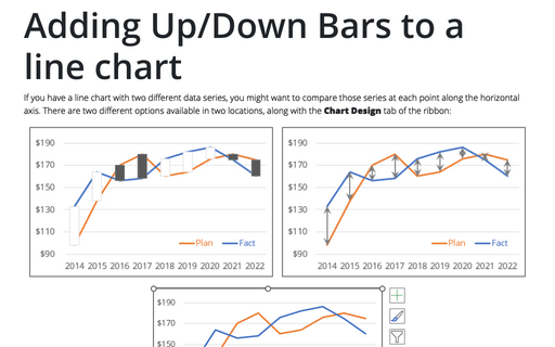
If you have a line chart with two different data series, you might want to compare those series at each point along the horizontal axis. There are two different options available in two locations, along with the Chart Design tab of the ribbon:
Creating automatically extended plot ranges
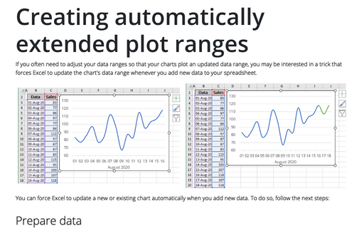
If you often need to adjust your data ranges so that your charts plot an updated data range, you may be interested in a trick that forces Excel to update the chart's data range whenever you add new data to your spreadsheet.
Creating a twin or double thermometer chart
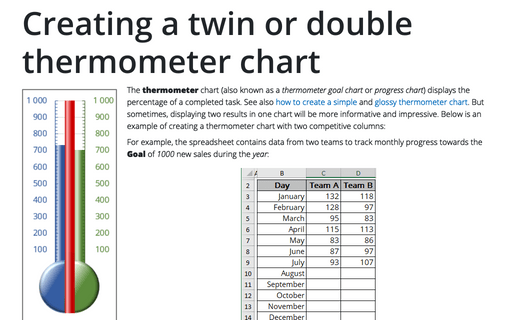
The thermometer chart (also known as a thermometer goal chart or progress chart) displays the percentage of a completed task. See also how to create a simple and glossy thermometer chart. But sometimes, displaying two results in one chart will be more informative and impressive. Below is an example of creating a thermometer chart with two competitive columns:
Creating a glossy thermometer chart
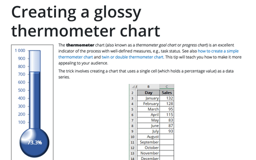
The thermometer chart (also known as a thermometer goal chart or progress chart) is an excellent indicator of the process with well-defined measures, e.g., task status. See also how to create a simple thermometer chart and twin or double thermometer chart. This tip will teach you how to make it more appealing to your audience.
Creating a simple thermometer chart
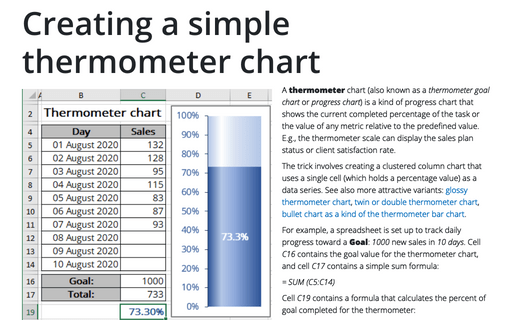
A thermometer chart (also known as a thermometer goal chart or progress chart) is a kind of progress chart that shows the current completed percentage of the task or the value of any metric relative to the predefined value. E.g., the thermometer scale can display the sales plan status or client satisfaction rate.
How to create irregular polygon charts in Excel
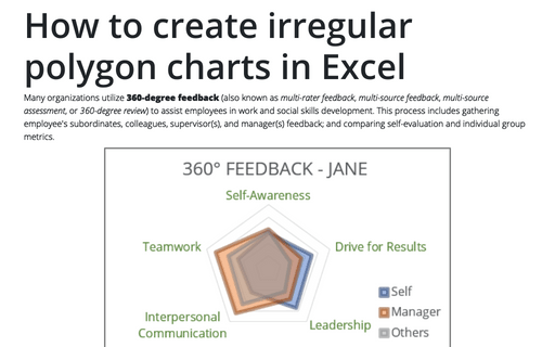
Many organizations utilize 360-degree feedback (also known as multi-rater feedback, multi-source feedback, multi-source assessment, or 360-degree review) to assist
employees in work and social skills development. This process includes gathering employee's subordinates, colleagues, supervisor(s), and manager(s) feedback; and comparing self-evaluation and individual group metrics.
A radar chart for personality assessment test visualization
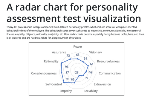
Today, HR professionals in large companies build detailed personality profiles, which include scores of workplace-oriented behavioral indices of the employee. The behavioral scores cover such areas as leadership, communication skills, interpersonal finesse, empathy, diligence, rationality, analyticity, etc.
How to compare strengths and weaknesses, skills, or performance metrics
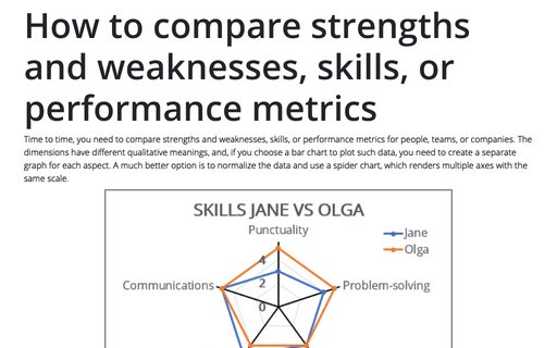
Time to time, you need to compare strengths and weaknesses, skills, or performance metrics for people, teams, or companies. The dimensions have different qualitative meanings, and, if you choose a bar chart to plot such data, you need to create a separate graph for each aspect.
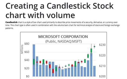
Creating a Candlestick Stock chart with volume
Candlestick chart is a style of bar-chart used primarily to describe price movements of a security, derivative, or currency over time. This chart type is often used in combination with the volume bars chart for technical analysis of stock and foreign exchange patterns.
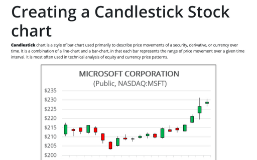
Creating a Candlestick Stock chart
Candlestick chart is a style of bar-chart used primarily to describe price movements of a security, derivative, or currency over time. It is a combination of a line-chart and a bar-chart, in that each bar represents the range of price movement over a given time interval. It is most often used in technical analysis of equity and currency price patterns.
