Excel 365
Bubble and Area chart
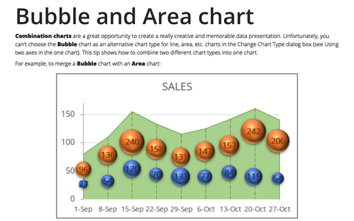
Combination charts are a great opportunity to create a really creative and memorable data presentation. Unfortunately, you can't choose the Bubble chart as an alternative chart type for line, area, etc. charts in the Change Chart Type dialog box (see Using two axes in the one chart). This tip shows how to combine two different chart types into one chart.
Speedometer chart
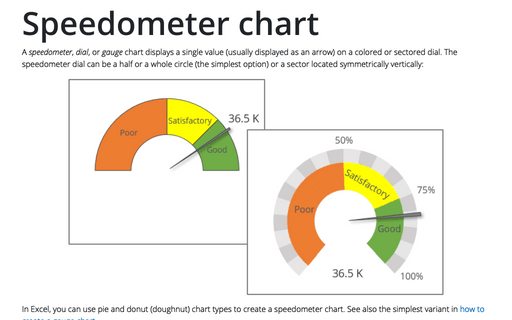
A speedometer, dial, or gauge chart displays a single value (usually displayed as an arrow) on a colored or sectored dial. The speedometer dial can be a half or a whole circle (the simplest option) or a sector located symmetrically vertically:
How to create Master and Scrolled Detail charts
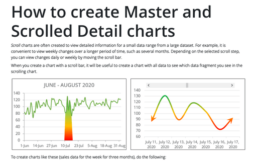
Scroll charts are often created to view detailed information for a small data range from a large dataset. For example, it is convenient to view weekly changes over a longer period of time, such as several months. Depending on the selected scroll step, you can view changes daily or weekly by moving the scroll bar.
How to create a Scrolling chart
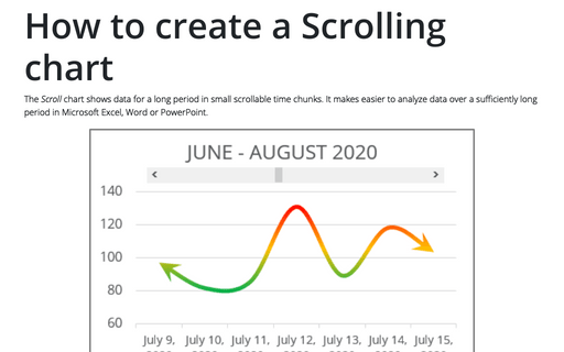
The Scroll chart shows data for a long period in small scrollable time chunks. It makes easier to analyze data over a sufficiently long period in Microsoft Excel, Word or PowerPoint.
The Scroll chart displays some contiguous range of data from a large dataset. Using the provided Control tools, it is possible to add a scroll bar to the chart area and view the desired data range:
The Scroll chart displays some contiguous range of data from a large dataset. Using the provided Control tools, it is possible to add a scroll bar to the chart area and view the desired data range:
Simple combination chart
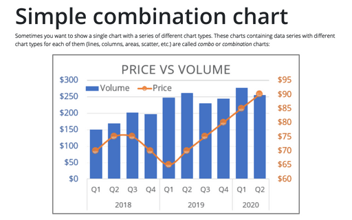
Sometimes you want to show a single chart with a series of different chart types. These charts containing data series with different chart types for each of them (lines, columns, areas, scatter, etc.) are called combo or combination charts:
Combining several charts into one chart
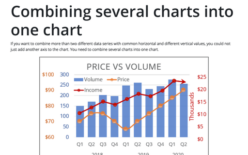
If you want to combine more than two different data series with common horizontal and different vertical values, you could not just add another axis to the chart. You need to combine several charts into one chart.
Using two axes in one chart
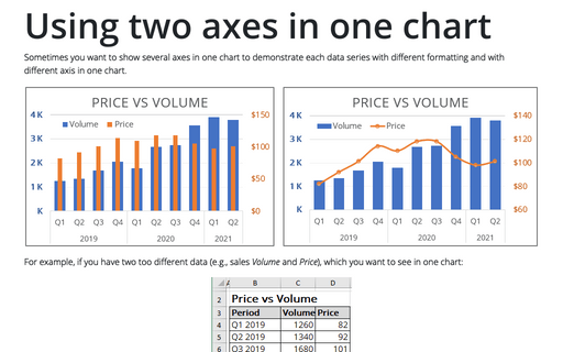
Sometimes you want to show several axes in one chart to demonstrate each data series with different
formatting and with different axis in one chart.
Excel 3-D Pie charts
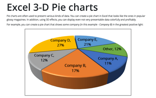
Pie charts are often used to present various kinds of data. You can create a pie chart in Excel that looks like the ones in popular glossy magazines. In addition, using 3D effects, you can display even not very presentable data colorfully and profitably.
Creating Pie of Pie and Bar of Pie charts
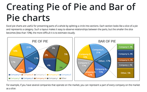
Excel pie charts are useful for presenting parts of a whole by splitting a circle into sections. Each section looks like a slice of a pie and represents a category. Such a layout makes it easy to observe relationships between the parts, but the smaller the slice becomes (less than 10%), the more difficult it is to estimate visually.
Using Pie Charts and Doughnut Charts in Excel
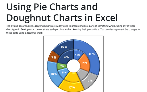
The pie and donut (in Excel, doughnut) charts are widely used to present multiple parts of something whole. Using any of these chart types in Excel, you can demonstrate each part in one chart keeping their proportions. You can also represent the changes in those parts using a doughnut chart:
